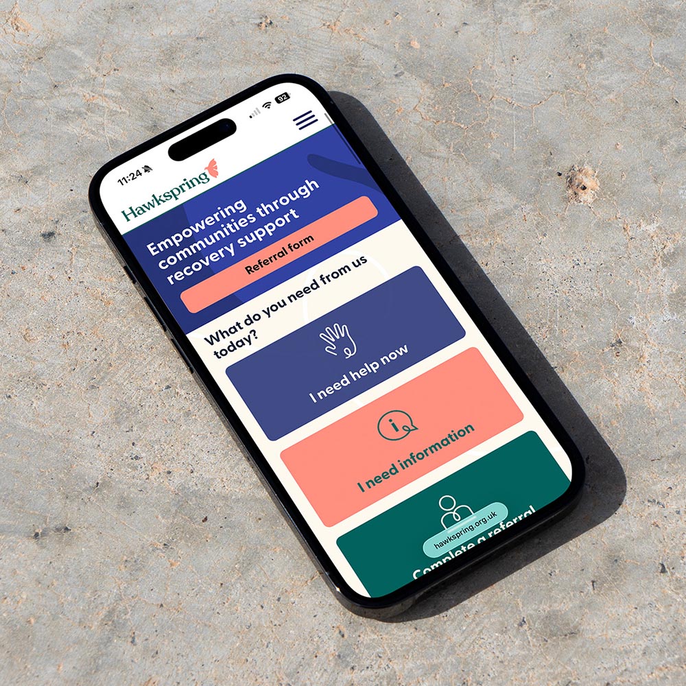
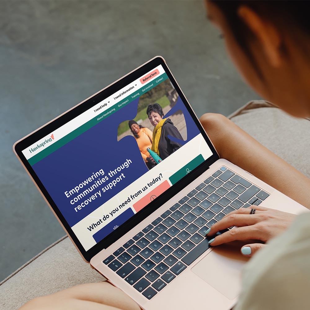
Hawkspring is a Bristol-basedcharity supporting people affected by drug and alcohol addiction. They needed a clearer, more professional brand presence to reflecttheir vital work and secure sustainable funding.
Challenge
Hawkspring's existing identity felt dated and their website was difficult to navigate, making it harder for people in crisis to access support and limiting confidence among funders and partners.
Approach
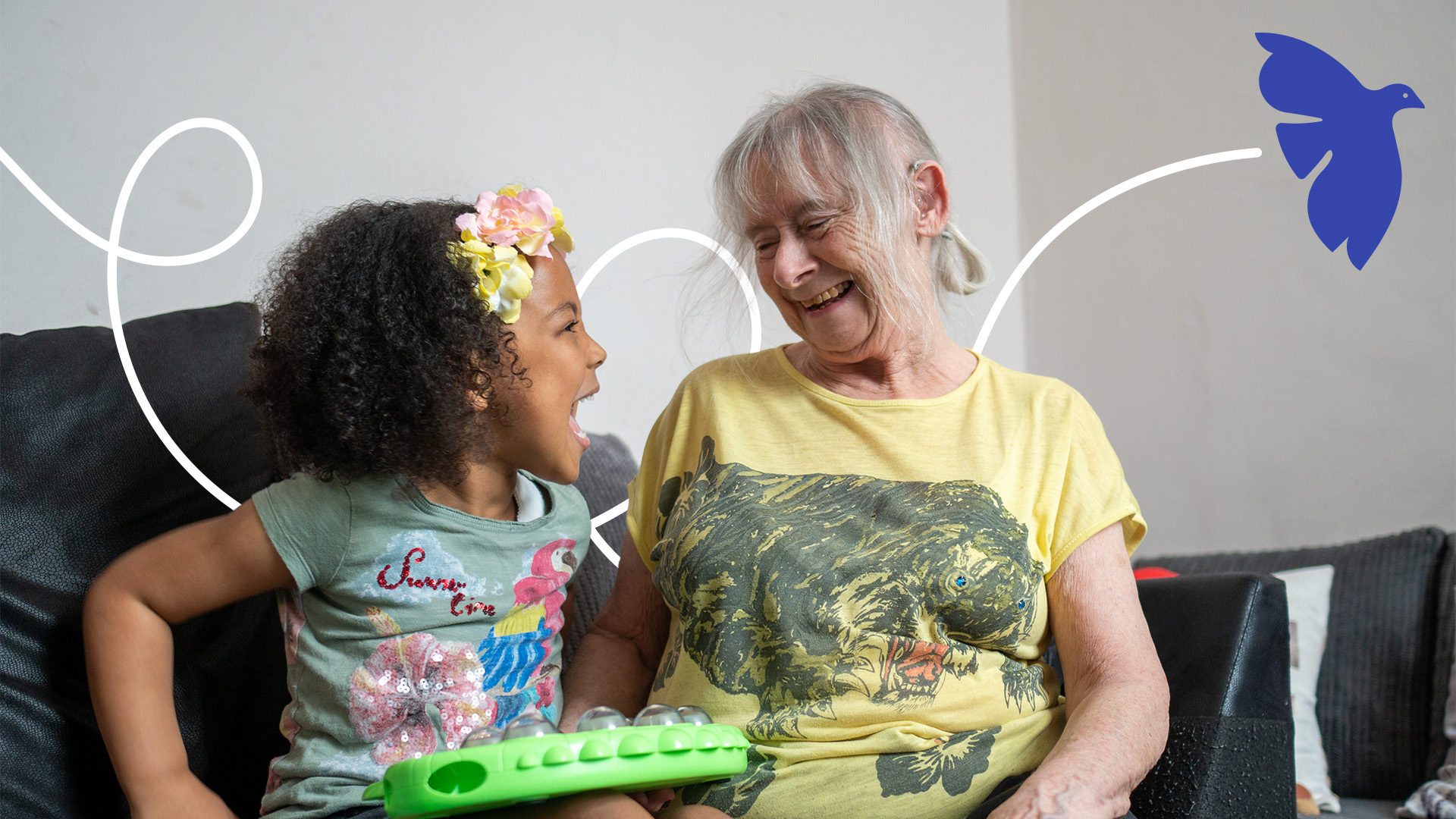
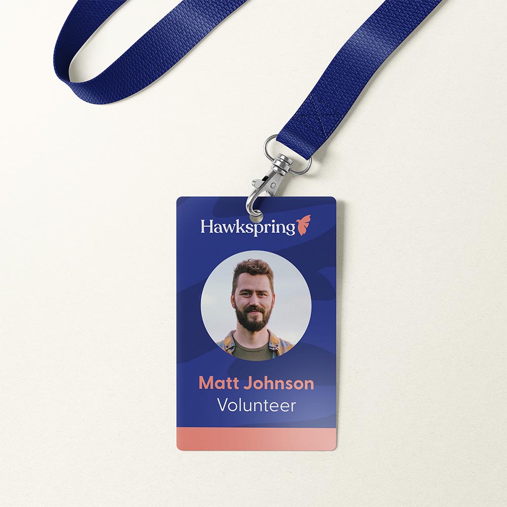
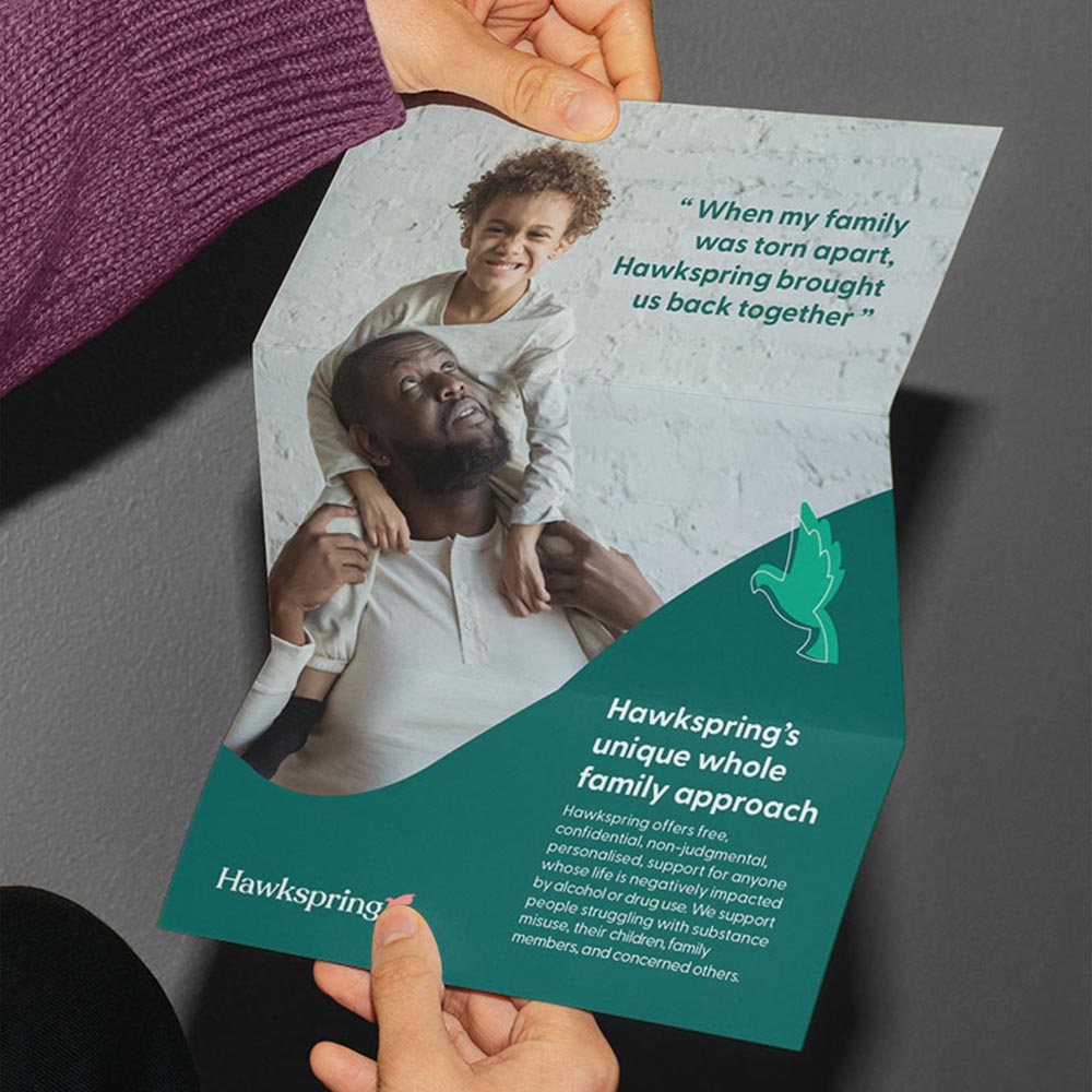
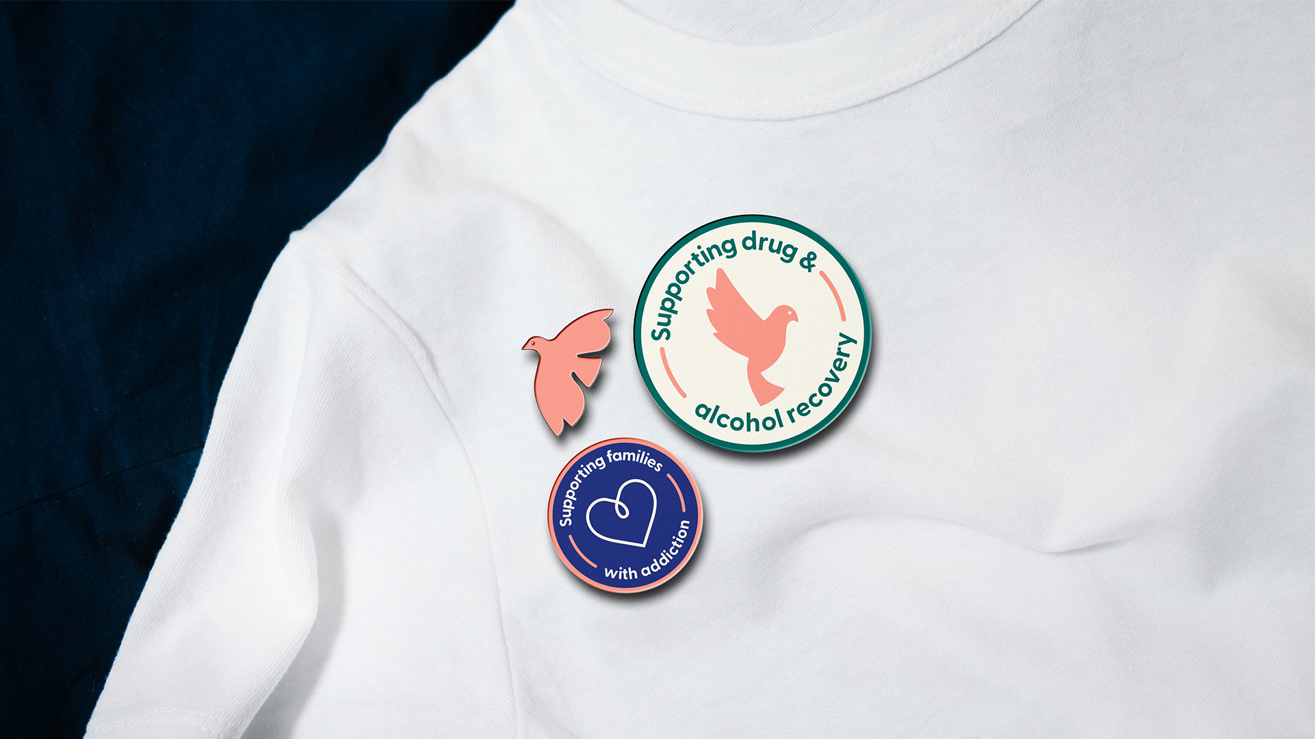
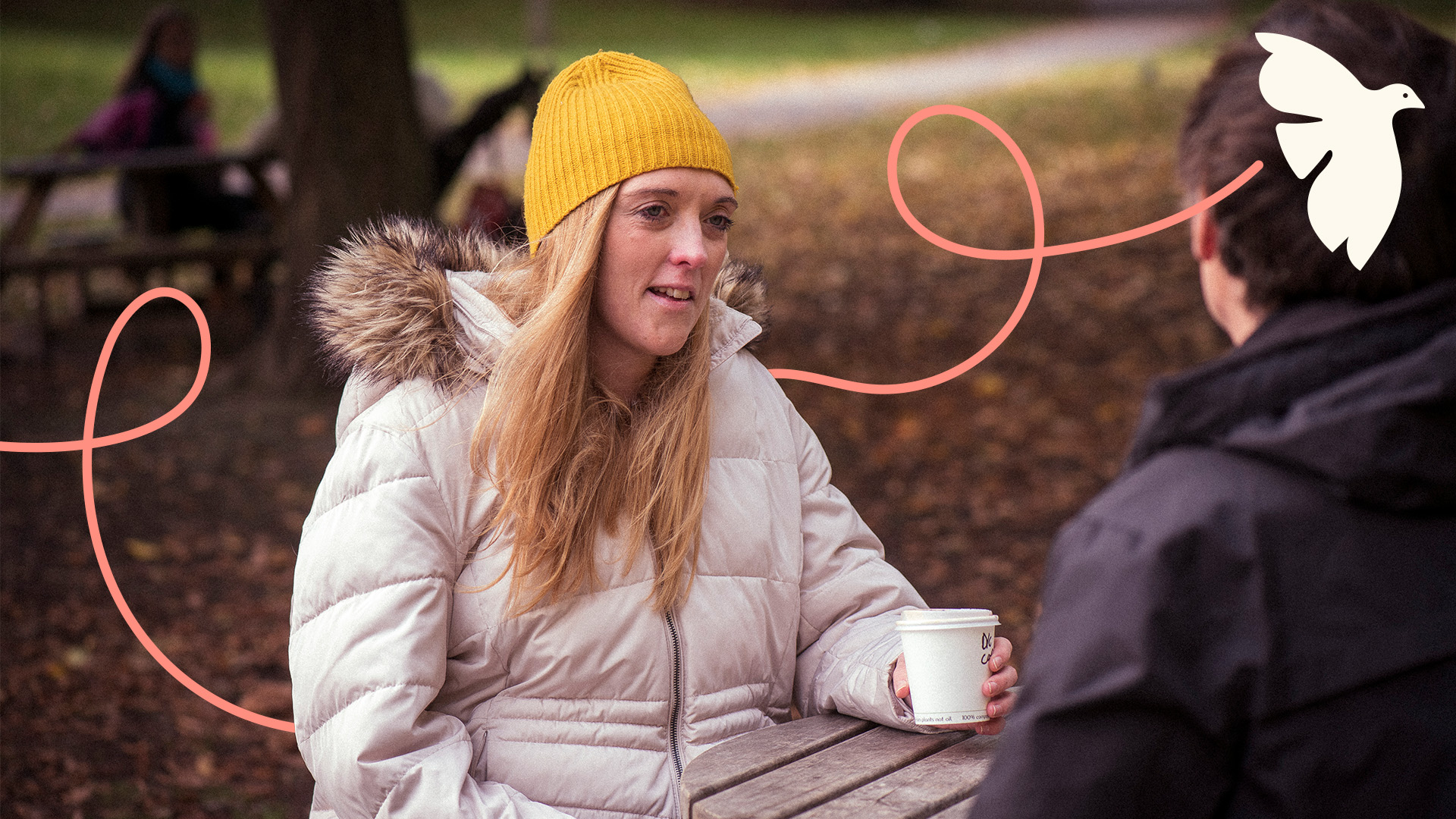
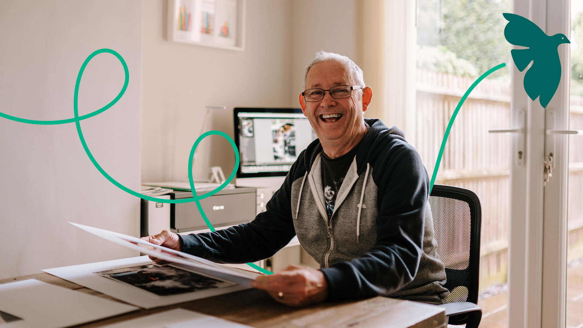
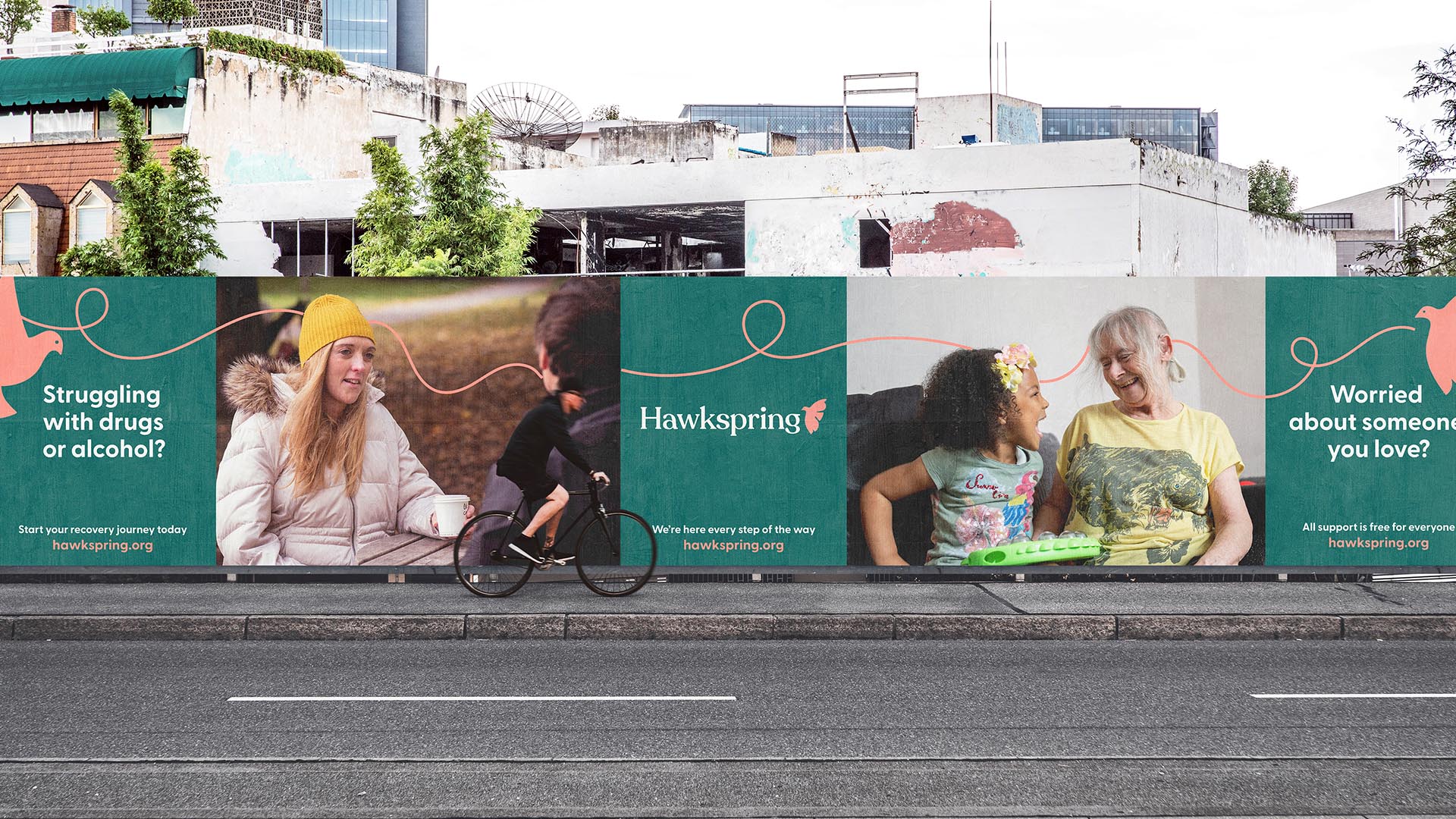
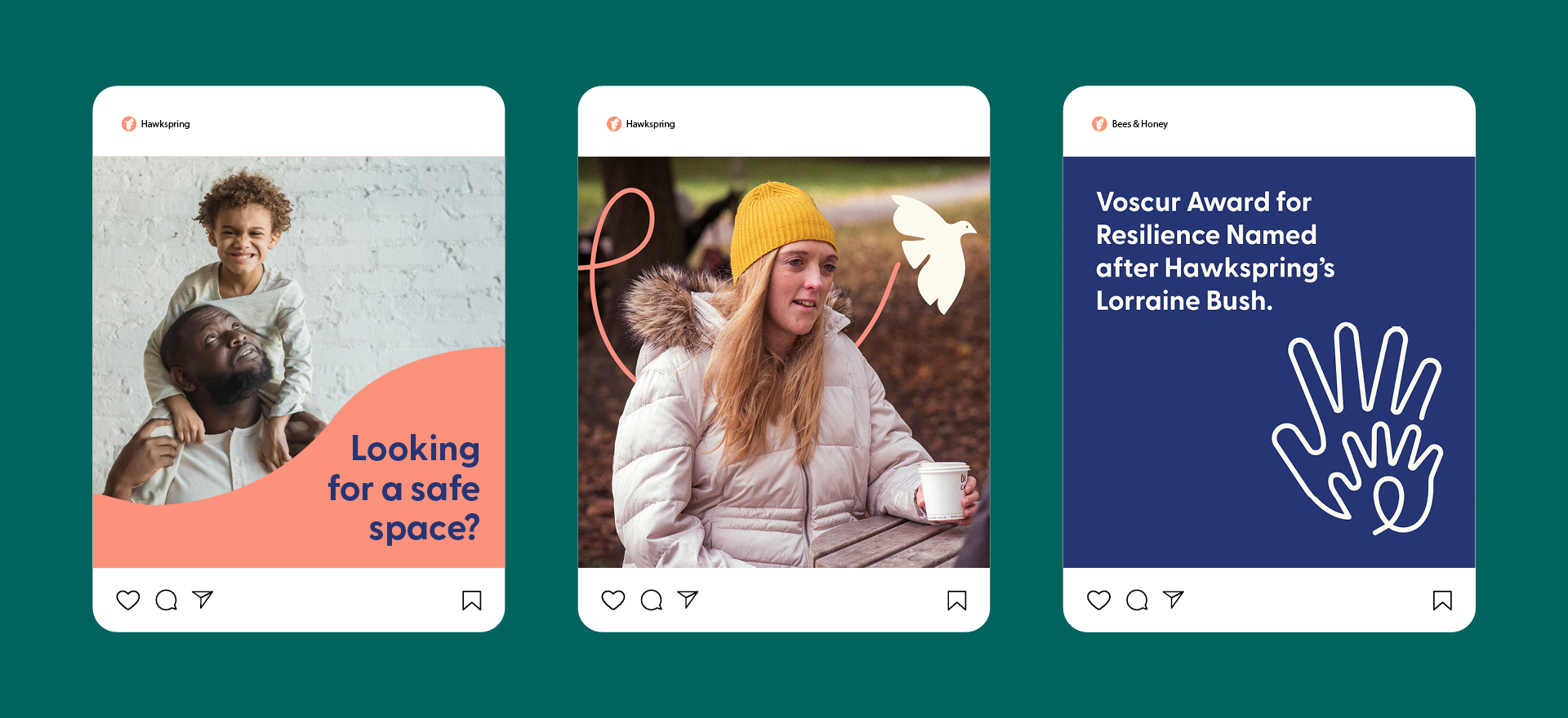
Every element of the identity was designed to reduce barriers and build trust. A softened hawk icon and looping flight path create a distinctive brand language inspired by guidance and recovery, while warm, candid photography replaces charity stereotypes with authentic, positive storytelling. The website experience was simplified through clear user journeys, intuitive navigation and carefully considered content hierarchy, making it easy for users to access support when they need it most. Accessible typography, generous spacing and WCAG-compliant colour contrast ensure the experience is inclusive for a wide range of users.
Outcome
The result is a modern, flexible identity that better reflects Hawkspring's values and supports both service users and funding opportunities. The redesigned website has helped strengthen the charity's professional presence and contributed to securing a £75,000 three-year grant from the Lloyds Bank Foundation.
Created while working as a Brand Designer at The Discourse. My work included brand strategy, visual identity, UX/UI design and website design. Project delivered by The Discourse.