Samuel Whitlock is a copywriter and creative strategist who believes every interaction with a brand is an opportunity to delight. His approach is strategy-informed but led by creative vision; using words to surprise and putting creativity and showmanship back into business.
Challenge
Sam’s visual identity didn’t reflect his creativity and ambition of his work. The challenge was to reposition him as a high-end independent; someone who could be considered alongside established studios and agencies, while being much more distinct, playful and boundary pushing.
Approach
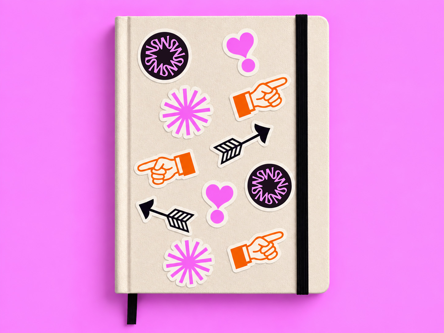
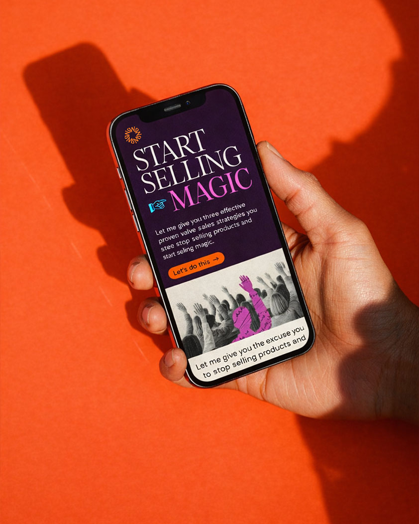
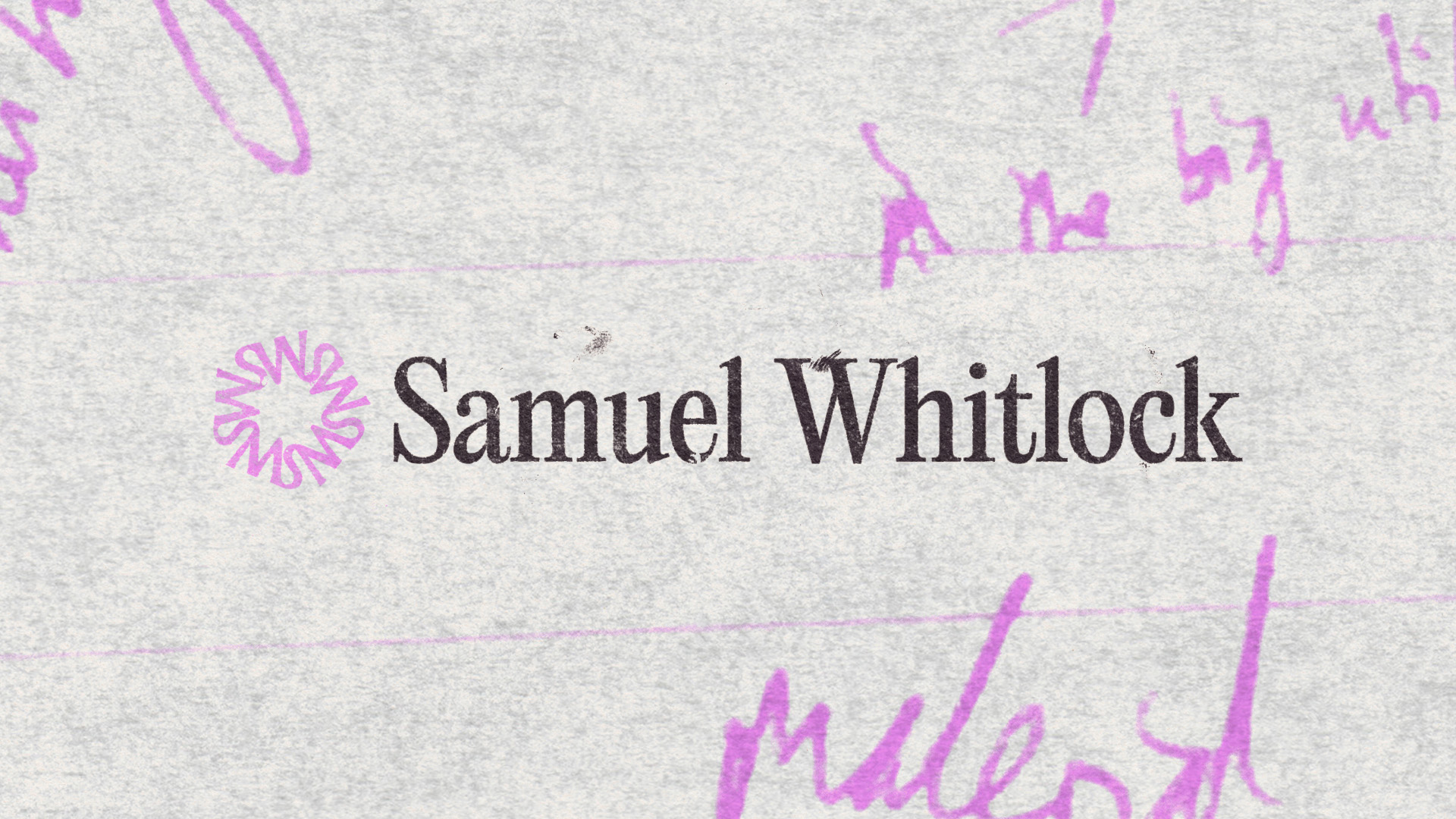
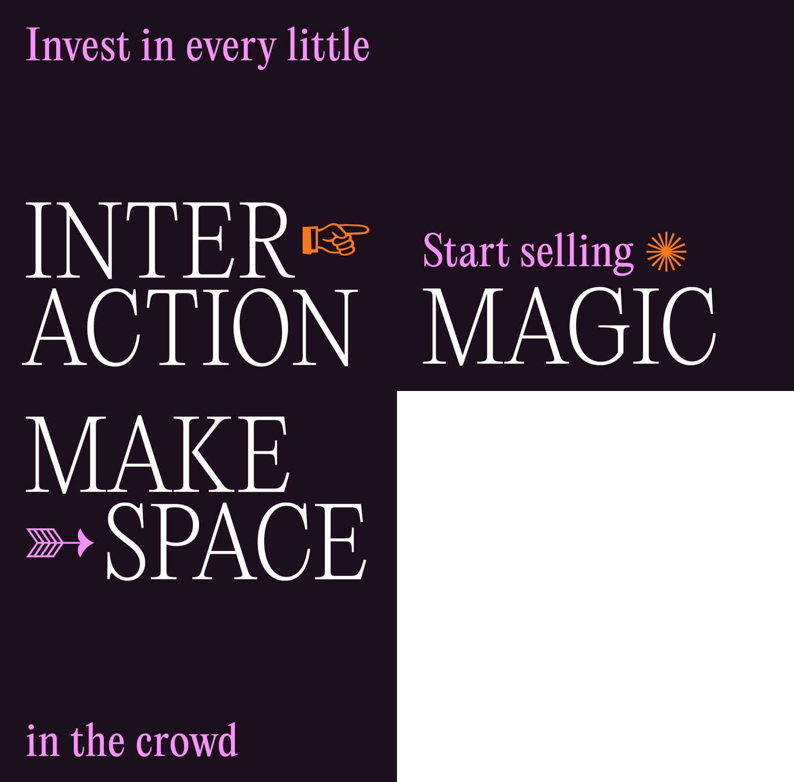
Make every interaction feel like magic became the central idea behind the brand.The visual direction focused on creating a sense of wonder and magic. Drawing on surrealism, I created a series of bespoke collages that combine people, objects and landscapes in unexpected, dreamlike compositions. Textures, handwritten notes and doodles by Sam create a more personal, tactile layer within the identity.
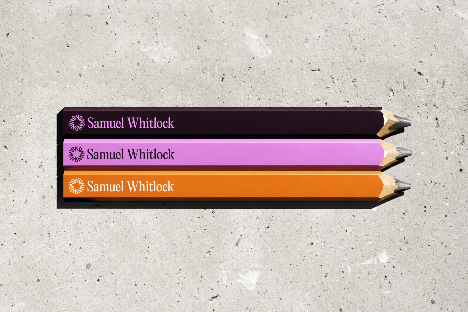
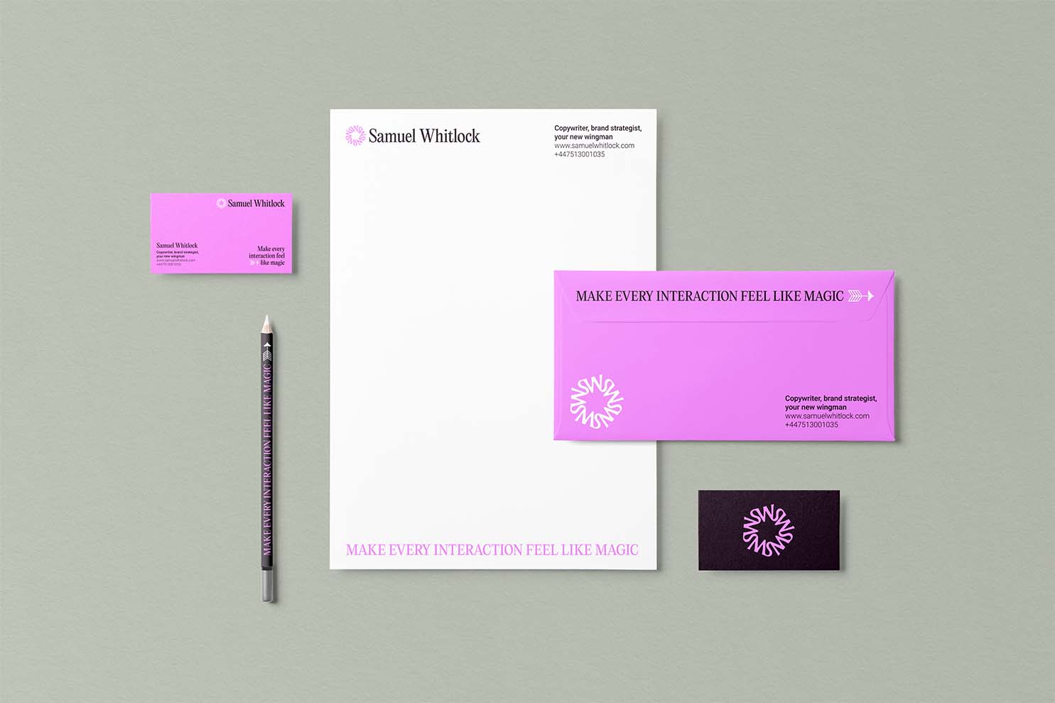
Alongside the expressive collage, I created a timeless monogram, giving the overall system a sense of craft and refinement.
Outcome
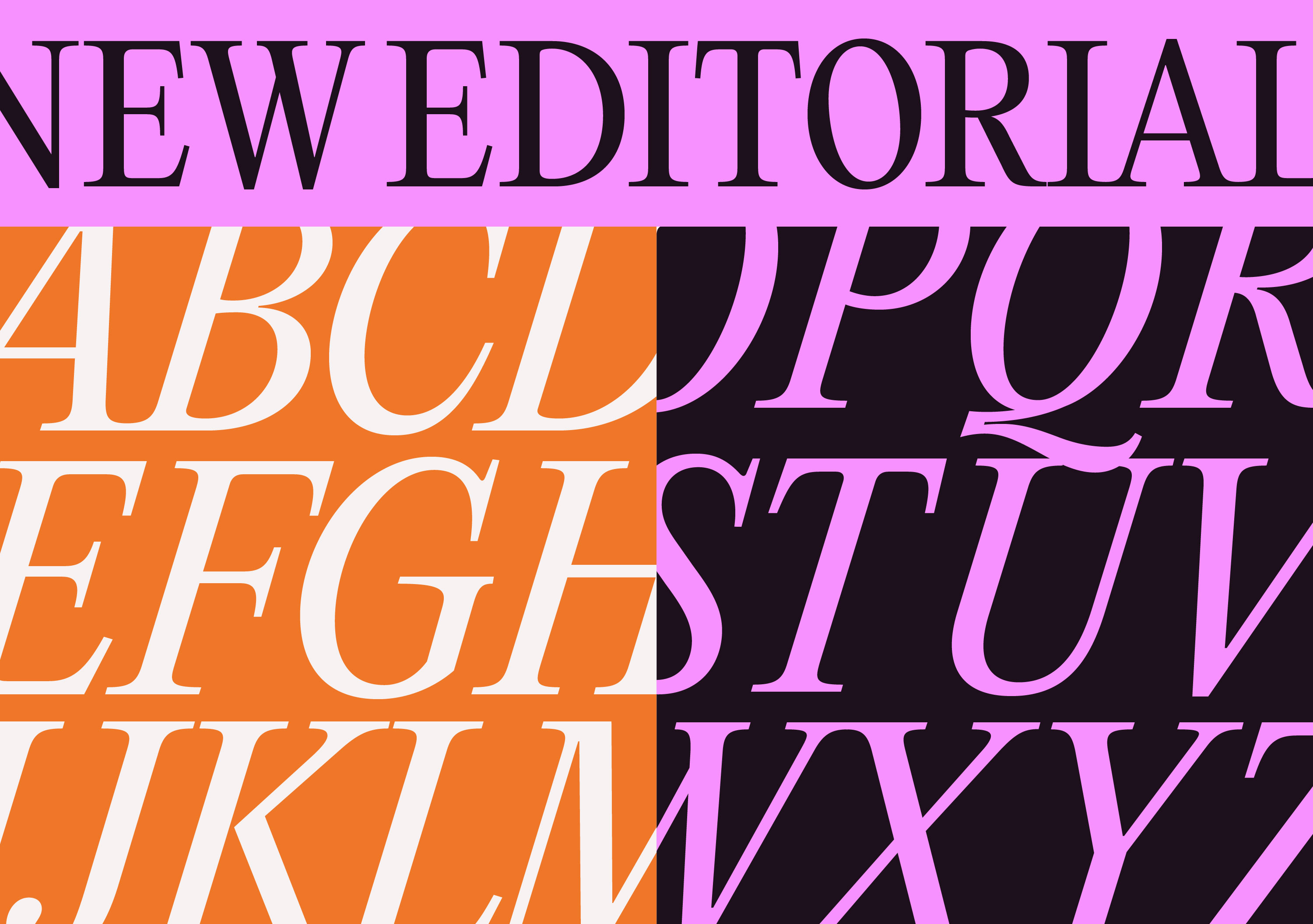
The new identity gives Sam a distinctive and flexible visual language that feels unique to him. Across his brand and communications, the system gives him room to continually experiment while maintaining a strong, recognisable presence, bringing the idea of “magic in every interaction” to life.


"The end result is not only a true presentation of my brand's core identity but also a visually arresting and interesting look that has already attracted many positive comments from both my clients and industry peers."
- Samuel Whitlock